Feeds:
Posts
Comments

Archive for August, 2010

Greek spam

MMMM sounds yummy but I’m actually talking about the spam comments I keep getting on my blog, I trash them and mark as spam so you’d never see them but but they keep coming back….what is the point of sending out this message:

можно было бы и без мата..
очень интересно. СПАСИБО.
Это — позор!
Прикольные слова
Могу порекомендовать зайти на сайт, где есть много информации на интересующую Вас тему.

Who the hell can read that? Zorba? I can’t. Is this effective?  And for that matter, the people who think that hacking someones email account and using their address book to send out ads for VitaTrimspa3000 and Vyagra is not the smartest. Who would buy anything from someone they just got duped by? I have no idea what they teach the marketing people in Greece and China and Botswana but this kind of selling  just doesn’t work. It’d be like a guy dressed as a Mormon coming to my door (I like Mormons) and once I open it they start in with their overstocked gotta move em frozen steak pitch… Sorry, that’s a nogo por moi. Whatever happened to good old, straightforward lying in advertising? The Doctor who prefers PallMalls because they sooth the throat. There are about 4 lies right there. Why be sneaky when you can just lie…. I actually love contemporary advertising because the powers that be have realized the only way to get the peoples attention is to be funny and or provocative. Like the latest ad for Dish network or whatever, the Russsian guy with the pet miniature giraffe… Brilliant. And the most brilliant thing is the dogs playing poker in the background. You don’t see them at first but it makes you pay attention to the ad the second and third time around. Doesn’t make me want to get a Dish but I will at least watch the whole thing. My Dad and I used to watch football and when the commercials would come on he would either say “good ad” or “poor ad”. Probably why I got into advertising. Don’t know why I never liked football.
Read Full Post »

why we paint what we paint

I was talking with fellow McRae art studio artist, Matthew Cornell about the nature of what we paint. We talked about why we make the choices we do. That’s nearly impossible to answer on behalf of other artists but I do have some theories. Art does one of several things; informs, documents, challenges or confronts, narrates and, finally, decorates. The latter is done really as a commercial enterprise so money would be the real motive. The art that challenges is generally considered unpopular to all but a handful of people because it goes against the norm. What we find challenging one year is not so the next. For example, the Impressionist movement was considered very controversial in it’s day, now Monet paintings hang in most halls and bathrooms around the country. The new controversial stuff is, well, controversial, and hard to like but maybe in 50 or 100 years it will be considered the norm and maybe people will have piles of salt with burned plastic babies in their bathrooms.

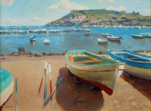
I’m more of a documentor, a landscape artist and painter of stuff; boats (above), interiors and the like. The still life might fall in the realm of the decorative, depending on how it’s done but there are a few artists whose work transcends that genre, Daniel Sprick is one. Winslow Homer, Sargent and Joaquin Sorolla fall into a more narrative/documentative category with work that tells a story or explains the everyday goings on at the time. The ideal is to create work that is both true to yourself and sellable but the two don’t always go together. The lesson usually is paint what you love unless of course you really need to make a buck.

Read Full Post »

new adjustment layer

I’m not really a computer savvy guy but I learn a thing here and there, mostly stuff that is relevant to what I do and not much else. I’ve never played a video game but I have fiddled with photoshop a little. One little problem I’ve encountered is (and it doesn’t happen often) what do I do with a washed out image if I want to paint from it. In this case I have an old slide, ca. 1950’s, that’s a little washed out. Maybe many of you don’t have photoshop CS2 or whatever so this may not apply but I’ve figured out a little thingygizmo that really helps to enhance a weak image. Normally you would go to levels to boost the midtones or darks and that’s a good start but if you go to Layer>new adjustment layer> you have a choice of levels, color balance, curves, etc and click on one, you get a little box. At the bottom is a a button that says normal, click on that and choose multiply. What that does is transparently layer a copy of the image on itself. You can mess with the values or the color balance of each layer and really get a full and more inspiring image.

At left is the original image at the top, next is just adjusting the levels and that the bottom is the new adjustment thingy. It’s subtle but makes a big difference as far as getting information into the washed out areas. I thought it was kinda cool.

Read Full Post »

maritimes

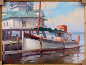
I don’t know what got into me but I decided to manufacture a maritime painting, rather than do it the way I normally do, which is to go to a marina and paint them while they sleep. I guess I found this wave reference that had a nice diagonal and then found a shot of a boat under sail that I liked and decided to put them together. Now I’m not really a technical marine artist, I don’t know my aft from a hole in the ground… I just happen to like painting boats. For example this is a skipjack, it’s a bay boat used for fishing and gathering oysters. You probably wouldn’t find it out in deep water but who says there can’t be a sudden swell in the bay? I’ve been in our own Tampa Bay sailing with a sizable swell. Anyway, it just sort of developed into a painting, first the diagonal, then the boat and then the idea for the foreground to be in shadow and the light licking the top of the sails. I took it down to my fav boat gallery in Vero and she was unsure about it, she says her peeps like boats at rest, the more peaceful the better. I’ll hold on to it, maybe send it up north. 20″x24″

Read Full Post »

This just in

I did a block in for this that I was going to post along with this image but damned if I can’t find it. Oh well. Here’s a very recent painting of boats in Italy. 30″x40″. I’m taking it down to my favorite boats gallery in Vero, Meghan Candler art gallery. Great lady, great gallery.

Read Full Post »

one I forgot

Jini asked me to post this painting, at least I think this is the one she meant. I forgot to post it but it’s from the Easton event. It’s called The captains house because, apparently it was the captains house at one time. 12×16. Painted in the baking sun while standing in a parking lot.

Read Full Post »

X,XL,XXL

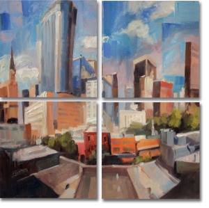
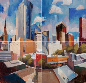
I posted a while back about a pricing conundrum for a public art job which I’ve resolved and have now completed. They wanted 2 large paintings, a 4’x7′ and a 70″x70″ quadtych (not sure if that’s a word) and a donation piece. They asked for loose, slightly abstracted cityscapes and I chose the theme of night and day and ordered 5 cradled wood art boxes rather than canvas. These will be hanging where there will be a lot of people and canvas is susceptible to sharp objects and these art boxes are pretty rigid structures. Plus our very own Cindy Anderson who has a frame shop at the studio makes them. First up is the study I did for their approval and then the final painting. They came by for review and loved it and said  just go for the next one don’t bother with a sketch. And no I didn’t paint these on site, I went downtown shot a bunch of pics and stitched them together in photoshop, adding to the fractured quality of these images.

Night. I was very happy with the way these turned out. They are big and the key to doing them was a lot of paint and a lot of medium and big brushes. I’m really hoping to do more like this just for me. Drawing them out rather than projecting them up allowed me to move things, push lines and refined the compositions.If you are ever in Orlando and you go to see a game at the new arena, that’s where you will find these.

Read Full Post »

You might be thinking, “What the hell is that?” or “Who did that?” or maybe “What does this have to do with landscape painting?”. Well, it’s like this, I was an illustrator for many, many, many years and being in essentially a small city, I had to become flexible with what I could do just so I could stay alive.  It was an extension of my being an art director (pre-illustration), every project was different, requiring different styles and approaches; art deco, Victorian, contemporary corporate, Swiss grids, whatever. I guess I felt that if a designer could switch styles, why couldn’t I?

I don’t get tired of talking about landscape painting but it is limiting in a way. So once in a while I may post something I, or someone else, have done that might be of interest. I was digging through my archives looking for stuff for an illustration show I’m going to be in, the show will be about process so I was looking for old sketches and illustrations and found this little gem. I don’t know why I like it so much, but I always have. It was just play time with a theme, I think it was for the Shakespeare theaters production of Macbeth but I’m not entirely sure. It’s been a while. But it’s the play thing that was so much fun. I was going for a post-industrial, futurist, Metropolis kind of Macbeth. No sketching just layering goauche, which is a great medium for this kind of work because of the lines you can pull with it… it’s a hard medium to get but it sure is good looking. It’s important for us as artists to break out of our norm once in a while and try something new. Collage, monoprints, abstract, sculpting in clay, take a Steve Aimone workshop, it’s all good and it’s all good for you. You can learn a lot when you are not trying so hard to be you.

Read Full Post »

A load of crap

Mother of Jeebus I’ve done a lot of crap work over the years. I was looking through some old files and found this piece of drek and thought I’d share it with you. Maybe it’s a way of saying, “See? We all improve eventually.” I can’t even count how many ways this thing is wrong. I don’t think it was done all that long ago either, maybe 7 or 8 years. It’s depressing to think about all the schmutz and the yuck I’ve perpetrated in my life as an artist, both as an illustrator and as a painter. This inspires me to go through all the crap work I’ve ever done and just toss it. It’ll take a while. I do think it is good to save a few pieces from the past to revisit now and again if for no other reason than to see that even though I (we) feel that I am (we are) spinning wheels with all the time at the easel, I (we) am (are) not. It’s a long slow journey to that next level and the level after that, but it really is about the journey. We are always in a state of arriving, even if we never really get there.

addendum   Someone emailed and asked just exactly what was wrong with this thing, so here’s a list;

1) The darks are all the same, there;s no suggestion of distance

2) Way to busy, no editing. Too many rocks.

3) Repitition of shapes, a lot of the same sized notes especially in the rocks.

4) The tree and the rock shadow next to it are roughly the same size and shape.

5) No variety in the color. No warm cool interplay.

6) Too many angles and not enough curves.

7) It’s kinda hard to tell exactly what we are looking at.

8) Too dark overall and not enough light in the shadows.

9) Not sure what the hell that smiley face is doing there in lieu of the 8 but it’s kinda funny.

Read Full Post »

Another painting for the upcoming show at Crealde, same show as the last post. Another large (for me) painting on site sketched out without a lot of planning. I always know that if a problem arises that I can fix it and if I can’t I can always sand it down and redo it. In the heat of the battle a lot of problems don’t become readily evident, especially at a larger size, in fact, it took me about a week to notice the large square hole placed nearly in the middle of this thing. No big thing however because I just went back in to it in the studio and busted up the square with some made up shrubbery. I also repainted the ground, the water, the tree to the right and pushed the distant shore back that was peeking through the trees to make it a little less busy. I like it…. for now.

Read Full Post »

Older Posts »